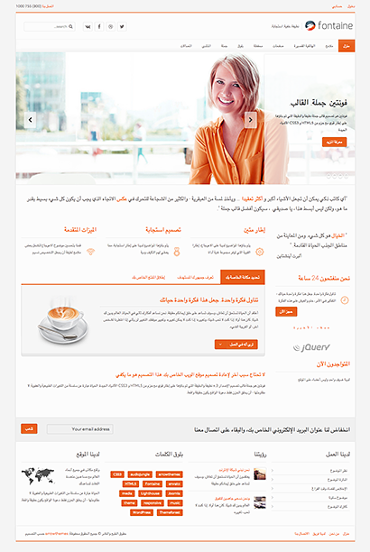
Bel Ons +32 (0)11 34 27 39

Agenda - aankondigingen

Design & Development

Design & Development

Perhaps travel cannot prevent bigotry, but by demonstrating that all peoples cry, laugh, eat, worry, and die


Business Dynamics

Our themes are built on Warp, a powerful framework which provides a rich tool set for development


Voice and data

Our themes are built on Warp, a powerful framework which provides a rich tool set for development


alt-icon

Community Ready

Perhaps travel cannot prevent bigotry, but by demonstrating that all peoples cry, laugh, eat, worry, and die


Qualified Professionals

Our themes are built on Warp, a powerful framework which provides a rich tool set for development


Target Audience

Our themes are built on Warp, a powerful framework which provides a rich tool set for development


Our Team

Our Directors

Charles Finney - Founder

Charles Finney

Founder

Change will not come if we wait for some other person or some other time


Linda Russ - Head of Marketing

Linda Russ

Head of Marketing

Change will not come if we wait for some other person or some other time


George Freeby - Head of ICT

George Freeby

Head of ICT

Change will not come if we wait for some other person or some other time


Perry Green - Head of Operations

Perry Green

Head of Operations

Change will not come if we wait for some other person or some other time


Our Management Team

Charles Finney - Founder

Charles Finney

Founder

Change will not come if we wait for some other person or some other time


Linda Russ - Head of Marketing

Linda Russ

Head of Marketing

Change will not come if we wait for some other person or some other time


George Freeby - Head of ICT

George Freeby

Head of ICT

Change will not come if we wait for some other person or some other time


Perry Green - Head of Operations

Perry Green

Head of Operations

Change will not come if we wait for some other person or some other time


Dark & Light Skins

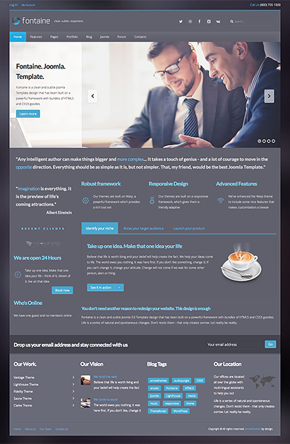
This theme is built in with color choosers that does a pretty job in helping you create your own skins. The template settings can be used to create both dark and light skins without loosing the elements color matching.


light color
dark color

Admin Panel

This theme is built on Warp Framework to give you the best experience in building your site. Warp framework is a light weight frameworkm, created by YOOtheme, which is built on a grid system and modular structure.

To make it even more intuitive, we've coded the frontend with UIkit. Uikit gives you a comprehensive collection of HTML, CSS, and JS components which is simple to use, easy to customize and extendable.


admin options admin options admin options admin options admin options

Color Styles

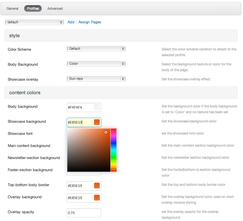
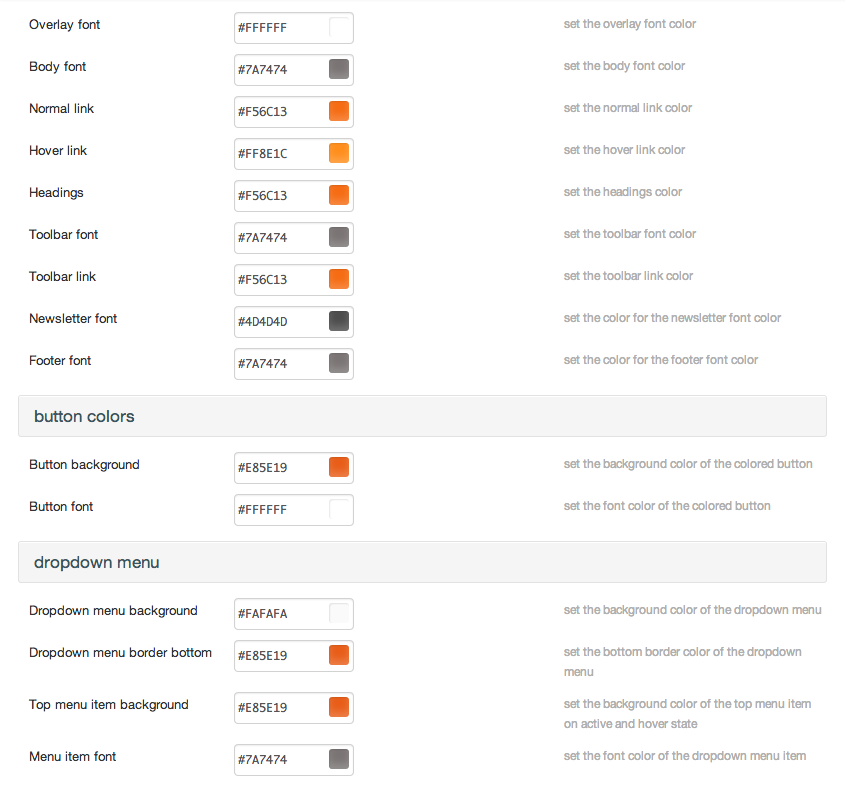
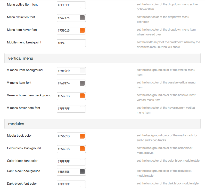
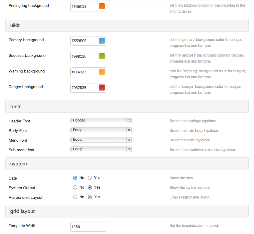
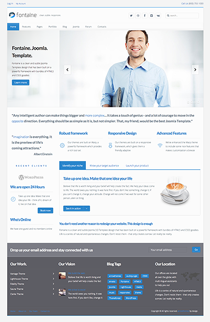
This theme comes packed with 6 color presets. The template settings also allows you to create an unlimited color profiles using the color pickers and pre-defined background settings. Check out the admin panel to see available options in the template backend.


tangerine
green
blue
salmon
turquoise
astral

Icon Fonts

Stroke 7 Icons

  • icon-7s-album
  • icon-7s-arc
  • icon-7s-back-2
  • icon-7s-bandaid
  • icon-7s-car
  • icon-7s-diamond
  • icon-7s-door-lock
  • icon-7s-eyedropper
  • icon-7s-female
  • icon-7s-gym
  • icon-7s-hammer
  • icon-7s-headphones
  • icon-7s-helm
  • icon-7s-hourglass
  • icon-7s-leaf
  • icon-7s-magic-wand
  • icon-7s-male
  • icon-7s-map-2
  • icon-7s-next-2
  • icon-7s-paint-bucket
  • icon-7s-pendrive
  • icon-7s-photo
  • icon-7s-piggy
  • icon-7s-plugin
  • icon-7s-refresh-2
  • icon-7s-rocket
  • icon-7s-settings
  • icon-7s-shield
  • icon-7s-smile
  • icon-7s-usb
  • icon-7s-vector
  • icon-7s-wine
  • icon-7s-cloud-upload
  • icon-7s-cash
  • icon-7s-close
  • icon-7s-bluetooth
  • icon-7s-cloud-download
  • icon-7s-way
  • icon-7s-close-circle
  • icon-7s-id
  • icon-7s-angle-up
  • icon-7s-wristwatch
  • icon-7s-angle-up-circle
  • icon-7s-world
  • icon-7s-angle-right
  • icon-7s-volume
  • icon-7s-angle-right-circle
  • icon-7s-users
  • icon-7s-angle-left
  • icon-7s-user-female
  • icon-7s-angle-left-circle
  • icon-7s-up-arrow
  • icon-7s-angle-down
  • icon-7s-switch
  • icon-7s-angle-down-circle
  • icon-7s-scissors
  • icon-7s-wallet
  • icon-7s-safe
  • icon-7s-volume2
  • icon-7s-volume1
  • icon-7s-voicemail
  • icon-7s-video
  • icon-7s-user
  • icon-7s-upload
  • icon-7s-unlock
  • icon-7s-umbrella
  • icon-7s-trash
  • icon-7s-tools
  • icon-7s-timer
  • icon-7s-ticket
  • icon-7s-target
  • icon-7s-sun
  • icon-7s-study
  • icon-7s-stopwatch
  • icon-7s-star
  • icon-7s-speaker
  • icon-7s-signal
  • icon-7s-shuffle
  • icon-7s-shopbag
  • icon-7s-share
  • icon-7s-server
  • icon-7s-search
  • icon-7s-film
  • icon-7s-science
  • icon-7s-disk
  • icon-7s-ribbon
  • icon-7s-repeat
  • icon-7s-refresh
  • icon-7s-add-user
  • icon-7s-refresh-cloud
  • icon-7s-paperclip
  • icon-7s-radio
  • icon-7s-note2
  • icon-7s-print
  • icon-7s-network
  • icon-7s-prev
  • icon-7s-mute
  • icon-7s-power
  • icon-7s-medal
  • icon-7s-portfolio
  • icon-7s-like2
  • icon-7s-plus
  • icon-7s-left-arrow
  • icon-7s-play
  • icon-7s-key
  • icon-7s-plane
  • icon-7s-joy
  • icon-7s-photo-gallery
  • icon-7s-pin
  • icon-7s-phone
  • icon-7s-plug
  • icon-7s-pen
  • icon-7s-right-arrow
  • icon-7s-paper-plane
  • icon-7s-delete-user
  • icon-7s-paint
  • icon-7s-bottom-arrow
  • icon-7s-notebook
  • icon-7s-note
  • icon-7s-next
  • icon-7s-news-paper
  • icon-7s-musiclist
  • icon-7s-music
  • icon-7s-mouse
  • icon-7s-more
  • icon-7s-moon
  • icon-7s-monitor
  • icon-7s-micro
  • icon-7s-menu
  • icon-7s-map
  • icon-7s-map-marker
  • icon-7s-mail
  • icon-7s-mail-open
  • icon-7s-mail-open-file
  • icon-7s-magnet
  • icon-7s-loop
  • icon-7s-look
  • icon-7s-lock
  • icon-7s-lintern
  • icon-7s-link
  • icon-7s-like
  • icon-7s-light
  • icon-7s-less
  • icon-7s-keypad
  • icon-7s-junk
  • icon-7s-info
  • icon-7s-home
  • icon-7s-help2
  • icon-7s-help1
  • icon-7s-graph3
  • icon-7s-graph2
  • icon-7s-graph1
  • icon-7s-graph
  • icon-7s-global
  • icon-7s-gleam
  • icon-7s-glasses
  • icon-7s-gift
  • icon-7s-folder
  • icon-7s-flag
  • icon-7s-filter
  • icon-7s-file
  • icon-7s-expand1
  • icon-7s-expand2
  • icon-7s-edit
  • icon-7s-drop
  • icon-7s-drawer
  • icon-7s-download
  • icon-7s-display2
  • icon-7s-display1
  • icon-7s-diskette
  • icon-7s-date
  • icon-7s-cup
  • icon-7s-culture
  • icon-7s-crop
  • icon-7s-credit
  • icon-7s-copy-file
  • icon-7s-config
  • icon-7s-compass
  • icon-7s-comment
  • icon-7s-coffee
  • icon-7s-cloud
  • icon-7s-clock
  • icon-7s-check
  • icon-7s-chat
  • icon-7s-cart
  • icon-7s-camera
  • icon-7s-call
  • icon-7s-calculator
  • icon-7s-browser
  • icon-7s-box2
  • icon-7s-box1
  • icon-7s-bookmarks
  • icon-7s-bicycle
  • icon-7s-bell
  • icon-7s-battery
  • icon-7s-ball
  • icon-7s-back
  • icon-7s-attention
  • icon-7s-anchor
  • icon-7s-albums
  • icon-7s-alarm
  • icon-7s-airplay

Web Application Icons

  • icon-adjust
  • icon-anchor
  • icon-archive
  • icon-area-chart
  • icon-arrows
  • icon-arrows-h
  • icon-arrows-v
  • icon-asterisk
  • icon-at
  • icon-automobile (alias)
  • icon-balance-scale
  • icon-ban
  • icon-bank (alias)
  • icon-bar-chart
  • icon-bar-chart-o (alias)
  • icon-barcode
  • icon-bars
  • icon-battery-empty (alias)
  • icon-battery-0
  • icon-battery-quarter (alias)
  • icon-battery-1
  • icon-battery-half (alias)
  • icon-battery-2
  • icon-battery-three-quarters (alias)
  • icon-battery-3
  • icon-battery-full (alias)
  • icon-battery-4
  • icon-bed
  • icon-beer
  • icon-bell
  • icon-bell-o
  • icon-bell-slash
  • icon-bell-slash-o
  • icon-bicycle
  • icon-binoculars
  • icon-birthday-cake
  • icon-bluetooth
  • icon-bluetooth-b
  • icon-bolt
  • icon-bomb
  • icon-book
  • icon-bookmark
  • icon-bookmark-o
  • icon-briefcase
  • icon-bug
  • icon-building
  • icon-building-o
  • icon-bullhorn
  • icon-bullseye
  • icon-bus
  • icon-cab (alias)
  • icon-calculator
  • icon-calendar
  • icon-calendar-check-o
  • icon-calendar-minus-o
  • icon-calendar-o
  • icon-calendar-plus-o
  • icon-calendar-times-o
  • icon-camera
  • icon-camera-retro
  • icon-car
  • icon-caret-square-o-down
  • icon-caret-square-o-left
  • icon-caret-square-o-right
  • icon-caret-square-o-up
  • icon-cart-arrow-down
  • icon-cart-plus
  • icon-cc
  • icon-certificate
  • icon-check
  • icon-check-circle
  • icon-check-circle-o
  • icon-check-square
  • icon-check-square-o
  • icon-child
  • icon-circle
  • icon-circle-o
  • icon-circle-o-notch
  • icon-circle-thin
  • icon-clock-o
  • icon-clone
  • icon-close (alias)
  • icon-cloud
  • icon-cloud-download
  • icon-cloud-upload
  • icon-code
  • icon-code-fork
  • icon-coffee
  • icon-cog
  • icon-cogs
  • icon-comment
  • icon-comment-o
  • icon-commenting
  • icon-commenting-o
  • icon-comments
  • icon-comments-o
  • icon-compass
  • icon-copyright
  • icon-creative-commons
  • icon-credit-card
  • icon-credit-card-alt
  • icon-crop
  • icon-crosshairs
  • icon-cube
  • icon-cubes
  • icon-cutlery
  • icon-dashboard (alias)
  • icon-database
  • icon-desktop
  • icon-diamond
  • icon-dot-circle-o
  • icon-download
  • icon-edit (alias)
  • icon-ellipsis-h
  • icon-ellipsis-v
  • icon-envelope
  • icon-envelope-o
  • icon-envelope-square
  • icon-eraser
  • icon-exchange
  • icon-exclamation
  • icon-exclamation-circle
  • icon-exclamation-triangle
  • icon-external-link
  • icon-external-link-square
  • icon-eye
  • icon-eye-slash
  • icon-eyedropper
  • icon-fax
  • icon-female
  • icon-fighter-jet
  • icon-file-archive-o
  • icon-file-audio-o
  • icon-file-code-o
  • icon-file-excel-o
  • icon-file-image-o
  • icon-file-movie-o (alias)
  • icon-file-pdf-o
  • icon-file-photo-o (alias)
  • icon-file-picture-o (alias)
  • icon-file-powerpoint-o
  • icon-file-sound-o (alias)
  • icon-file-video-o
  • icon-file-word-o
  • icon-file-zip-o (alias)
  • icon-film
  • icon-filter
  • icon-fire
  • icon-fire-extinguisher
  • icon-flag
  • icon-flag-checkered
  • icon-flag-o
  • icon-flash (alias)
  • icon-flask
  • icon-folder
  • icon-folder-o
  • icon-folder-open
  • icon-folder-open-o
  • icon-frown-o
  • icon-futbol-o
  • icon-gamepad
  • icon-gavel
  • icon-gear (alias)
  • icon-gears (alias)
  • icon-genderless (alias)
  • icon-gift
  • icon-glass
  • icon-globe
  • icon-graduation-cap
  • icon-group (alias)
  • icon-hand-lizard-o
  • icon-hand-stop-o (alias)
  • icon-hand-paper-o
  • icon-hand-peace-o
  • icon-hand-pointer-o
  • icon-hand-grab-o (alias)
  • icon-hand-rock-o
  • icon-hand-scissors-o
  • icon-hand-spock-o
  • icon-hdd-o
  • icon-hashtag
  • icon-headphones
  • icon-heart
  • icon-heart-o
  • icon-heartbeat
  • icon-history
  • icon-home
  • icon-hotel (alias)
  • icon-hourglass
  • icon-hourglass-o
  • icon-hourglass-1 (alias)
  • icon-hourglass-start
  • icon-hourglass-2 (alias)
  • icon-hourglass-half
  • icon-hourglass-3 (alias)
  • icon-hourglass-end
  • icon-i-cursor
  • icon-image (alias)
  • icon-inbox
  • icon-industry
  • icon-info
  • icon-info-circle
  • icon-institution (alias)
  • icon-key
  • icon-keyboard-o
  • icon-language
  • icon-laptop
  • icon-leaf
  • icon-legal (alias)
  • icon-lemon-o
  • icon-level-down
  • icon-level-up
  • icon-life-bouy (alias)
  • icon-life-buoy (alias)
  • icon-life-ring
  • icon-life-saver (alias)
  • icon-lightbulb-o
  • icon-line-chart
  • icon-location-arrow
  • icon-lock
  • icon-magic
  • icon-magnet
  • icon-mail-forward (alias)
  • icon-mail-reply (alias)
  • icon-mail-reply-all (alias)
  • icon-male
  • icon-map
  • icon-map-marker
  • icon-map-o
  • icon-map-pin
  • icon-map-signs
  • icon-meh-o
  • icon-microphone
  • icon-microphone-slash
  • icon-minus
  • icon-minus-circle
  • icon-minus-square
  • icon-minus-square-o
  • icon-mobile
  • icon-mobile-phone (alias)
  • icon-money
  • icon-moon-o
  • icon-mortar-board (alias)
  • icon-motorcycle
  • icon-mouse-pointer
  • icon-music
  • icon-navicon (alias)
  • icon-newspaper-o
  • icon-object-group
  • icon-object-ungroup
  • icon-paint-brush
  • icon-paper-plane
  • icon-paper-plane-o
  • icon-paw
  • icon-pencil
  • icon-pencil-square
  • icon-pencil-square-o
  • icon-phone
  • icon-phone-square
  • icon-photo (alias)
  • icon-picture-o
  • icon-pie-chart
  • icon-plane
  • icon-plug
  • icon-plus
  • icon-plus-circle
  • icon-plus-square
  • icon-plus-square-o
  • icon-power-off
  • icon-print
  • icon-puzzle-piece
  • icon-qrcode
  • icon-question
  • icon-question-circle
  • icon-quote-left
  • icon-quote-right
  • icon-random
  • icon-recycle
  • icon-refresh
  • icon-registered
  • icon-remove (alias)
  • icon-reorder (alias)
  • icon-reply
  • icon-reply-all
  • icon-retweet
  • icon-road
  • icon-rocket
  • icon-rss
  • icon-rss-square
  • icon-search
  • icon-search-minus
  • icon-search-plus
  • icon-send (alias)
  • icon-send-o (alias)
  • icon-server
  • icon-share
  • icon-share-alt
  • icon-share-alt-square
  • icon-share-square
  • icon-share-square-o
  • icon-shield
  • icon-ship
  • icon-shopping-bag
  • icon-shopping-basket
  • icon-shopping-cart
  • icon-sign-in
  • icon-sign-out
  • icon-signal
  • icon-sitemap
  • icon-sliders
  • icon-smile-o
  • icon-soccer-ball-o (alias)
  • icon-sort
  • icon-sort-alpha-asc
  • icon-sort-alpha-desc
  • icon-sort-amount-asc
  • icon-sort-amount-desc
  • icon-sort-asc
  • icon-sort-desc
  • icon-sort-down (alias)
  • icon-sort-numeric-asc
  • icon-sort-numeric-desc
  • icon-sort-up (alias)
  • icon-space-shuttle
  • icon-spinner
  • icon-spoon
  • icon-square
  • icon-square-o
  • icon-star
  • icon-star-half
  • icon-star-half-empty (alias)
  • icon-star-half-full (alias)
  • icon-star-half-o
  • icon-star-o
  • icon-sticky-note
  • icon-sticky-note-o
  • icon-street-view
  • icon-suitcase
  • icon-sun-o
  • icon-support (alias)
  • icon-tablet
  • icon-tachometer
  • icon-tag
  • icon-tags
  • icon-tasks
  • icon-taxi
  • icon-television
  • icon-terminal
  • icon-thumb-tack
  • icon-thumbs-down
  • icon-thumbs-o-down
  • icon-thumbs-o-up
  • icon-thumbs-up
  • icon-ticket
  • icon-times
  • icon-times-circle
  • icon-times-circle-o
  • icon-tint
  • icon-toggle-down (alias)
  • icon-toggle-left (alias)
  • icon-toggle-off
  • icon-toggle-on
  • icon-toggle-right (alias)
  • icon-toggle-up (alias)
  • icon-trademark
  • icon-trash
  • icon-trash-o
  • icon-tree
  • icon-trophy
  • icon-truck
  • icon-tty
  • icon-tv (alias)
  • icon-umbrella
  • icon-university
  • icon-unlock
  • icon-unlock-alt
  • icon-unsorted (alias)
  • icon-upload
  • icon-usb
  • icon-user
  • icon-user-plus
  • icon-user-secret
  • icon-user-times
  • icon-users
  • icon-video-camera
  • icon-volume-down
  • icon-volume-off
  • icon-volume-up
  • icon-warning (alias)
  • icon-wheelchair
  • icon-wifi
  • icon-wrench

Transportation Icons

  • icon-ambulance
  • icon-automobile (alias)
  • icon-bicycle
  • icon-bus
  • icon-cab (alias)
  • icon-car
  • icon-fighter-jet
  • icon-motorcycle
  • icon-plane
  • icon-rocket
  • icon-ship
  • icon-space-shuttle
  • icon-subway
  • icon-taxi
  • icon-train
  • icon-truck
  • icon-wheelchair

Hand Icons

  • icon-hand-lizard-o
  • icon-hand-stop-o (alias)
  • icon-hand-paper-o
  • icon-hand-peace-o
  • icon-hand-pointer-o
  • icon-hand-grab-o (alias)
  • icon-hand-rock-o
  • icon-hand-scissors-o
  • icon-hand-spock-o
  • icon-thumb-tack
  • icon-thumbs-down
  • icon-thumbs-o-down
  • icon-thumbs-o-up
  • icon-thumbs-up

Gender Icons

  • icon-genderless (alias)
  • icon-mars
  • icon-mars-double
  • icon-mars-stroke
  • icon-mars-stroke-h
  • icon-mars-stroke-v
  • icon-mercury
  • icon-neuter
  • icon-transgender
  • icon-transgender-alt
  • icon-venus
  • icon-venus-double
  • icon-venus-mars

File Type Icons

  • icon-file
  • icon-file-archive-o
  • icon-file-audio-o
  • icon-file-code-o
  • icon-file-excel-o
  • icon-file-image-o
  • icon-file-movie-o (alias)
  • icon-file-o
  • icon-file-pdf-o
  • icon-file-photo-o (alias)
  • icon-file-picture-o (alias)
  • icon-file-powerpoint-o
  • icon-file-sound-o (alias)
  • icon-file-text
  • icon-file-text-o
  • icon-file-video-o
  • icon-file-word-o
  • icon-file-zip-o (alias)

Spinner Icons

  • icon-circle-o-notch
  • icon-cog
  • icon-gear (alias)
  • icon-refresh
  • icon-spinner

Form Control Icons

  • icon-check-square
  • icon-check-square-o
  • icon-circle
  • icon-circle-o
  • icon-dot-circle-o
  • icon-minus-square
  • icon-minus-square-o
  • icon-plus-square
  • icon-plus-square-o
  • icon-square
  • icon-square-o

Payment Icons

  • icon-cc-amex
  • icon-cc-diners-club
  • icon-cc-discover
  • icon-cc-jcb
  • icon-cc-mastercard
  • icon-cc-paypal
  • icon-cc-stripe
  • icon-cc-visa
  • icon-credit-card
  • icon-google-wallet
  • icon-paypal

Currency Icons

  • icon-bitcoin (alias)
  • icon-btc
  • icon-cny (alias)
  • icon-dollar (alias)
  • icon-eur
  • icon-euro (alias)
  • icon-gbp
  • icon-ils
  • icon-inr
  • icon-jpy
  • icon-krw
  • icon-money
  • icon-rmb (alias)
  • icon-rouble (alias)
  • icon-rub
  • icon-ruble (alias)
  • icon-rupee (alias)
  • icon-shekel (alias)
  • icon-sheqel (alias)
  • icon-try
  • icon-turkish-lira (alias)
  • icon-usd
  • icon-won (alias)
  • icon-yen (alias)

Text Editor Icons

  • icon-align-center
  • icon-align-justify
  • icon-align-left
  • icon-align-right
  • icon-bold
  • icon-chain (alias)
  • icon-chain-broken
  • icon-clipboard
  • icon-columns
  • icon-copy (alias)
  • icon-cut (alias)
  • icon-dedent (alias)
  • icon-eraser
  • icon-file
  • icon-file-o
  • icon-file-text
  • icon-file-text-o
  • icon-files-o
  • icon-floppy-o
  • icon-font
  • icon-header
  • icon-indent
  • icon-italic
  • icon-link
  • icon-list
  • icon-list-alt
  • icon-list-ol
  • icon-list-ul
  • icon-outdent
  • icon-paperclip
  • icon-paragraph
  • icon-paste (alias)
  • icon-repeat
  • icon-rotate-left (alias)
  • icon-rotate-right (alias)
  • icon-save (alias)
  • icon-scissors
  • icon-strikethrough
  • icon-subscript
  • icon-superscript
  • icon-table
  • icon-text-height
  • icon-text-width
  • icon-th
  • icon-th-large
  • icon-th-list
  • icon-underline
  • icon-undo
  • icon-unlink (alias)

Directional Icons

  • icon-angle-double-down
  • icon-angle-double-left
  • icon-angle-double-right
  • icon-angle-double-up
  • icon-angle-down
  • icon-angle-left
  • icon-angle-right
  • icon-angle-up
  • icon-arrow-circle-down
  • icon-arrow-circle-left
  • icon-arrow-circle-o-down
  • icon-arrow-circle-o-left
  • icon-arrow-circle-o-right
  • icon-arrow-circle-o-up
  • icon-arrow-circle-right
  • icon-arrow-circle-up
  • icon-arrow-down
  • icon-arrow-left
  • icon-arrow-right
  • icon-arrow-up
  • icon-arrows
  • icon-arrows-alt
  • icon-arrows-h
  • icon-arrows-v
  • icon-caret-down
  • icon-caret-left
  • icon-caret-right
  • icon-caret-square-o-down
  • icon-caret-square-o-left
  • icon-caret-square-o-right
  • icon-caret-square-o-up
  • icon-caret-up
  • icon-chevron-circle-down
  • icon-chevron-circle-left
  • icon-chevron-circle-right
  • icon-chevron-circle-up
  • icon-chevron-down
  • icon-chevron-left
  • icon-chevron-right
  • icon-chevron-up
  • icon-hand-o-down
  • icon-hand-o-left
  • icon-hand-o-right
  • icon-hand-o-up
  • icon-long-arrow-down
  • icon-long-arrow-left
  • icon-long-arrow-right
  • icon-long-arrow-up
  • icon-toggle-down (alias)
  • icon-toggle-left (alias)
  • icon-toggle-right (alias)
  • icon-toggle-up (alias)

Video Player Icons

  • icon-arrows-alt
  • icon-backward
  • icon-compress
  • icon-eject
  • icon-expand
  • icon-fast-backward
  • icon-fast-forward
  • icon-forward
  • icon-pause
  • icon-pause-circle
  • icon-pause-circle-o
  • icon-play
  • icon-play-circle
  • icon-play-circle-o
  • icon-step-backward
  • icon-step-forward
  • icon-stop
  • icon-stop-circle
  • icon-stop-circle-o
  • icon-youtube-play

Brand Icons

  • icon-500px
  • icon-adn
  • icon-amazon
  • icon-android
  • icon-angellist
  • icon-apple
  • icon-behance
  • icon-behance-square
  • icon-bitbucket
  • icon-bitbucket-square
  • icon-bitcoin (alias)
  • icon-black-tie
  • icon-bluetooth
  • icon-bluetooth-b
  • icon-btc
  • icon-buysellads
  • icon-cc-amex
  • icon-cc-diners-club
  • icon-cc-discover
  • icon-cc-jcb
  • icon-cc-mastercard
  • icon-cc-paypal
  • icon-cc-stripe
  • icon-cc-visa
  • icon-chrome
  • icon-codepen
  • icon-codiepie
  • icon-connectdevelop
  • icon-contao
  • icon-css3
  • icon-dashcube
  • icon-delicious
  • icon-deviantart
  • icon-digg
  • icon-dribbble
  • icon-dropbox
  • icon-drupal
  • icon-edge
  • icon-empire
  • icon-expeditedssl
  • icon-facebook
  • icon-facebook-f (alias)
  • icon-facebook-official
  • icon-facebook-square
  • icon-firefox
  • icon-flickr
  • icon-fonticons
  • icon-fort-awesome
  • icon-forumbee
  • icon-foursquare
  • icon-ge (alias)
  • icon-get-pocket
  • icon-gg
  • icon-gg-circle
  • icon-git
  • icon-git-square
  • icon-github
  • icon-github-alt
  • icon-github-square
  • icon-gittip (alias)
  • icon-google
  • icon-google-plus
  • icon-google-plus-square
  • icon-google-wallet
  • icon-gratipay
  • icon-hacker-news
  • icon-houzz
  • icon-html5
  • icon-instagram
  • icon-internet-explorer
  • icon-ioxhost
  • icon-joomla
  • icon-jsfiddle
  • icon-lastfm
  • icon-lastfm-square
  • icon-leanpub
  • icon-linkedin
  • icon-linkedin-square
  • icon-linux
  • icon-maxcdn
  • icon-meanpath
  • icon-medium-logo
  • icon-mixcloud
  • icon-modx
  • icon-odnoklassniki
  • icon-odnoklassniki-square
  • icon-opencart
  • icon-openid
  • icon-opera
  • icon-optin-monster
  • icon-pagelines
  • icon-paypal
  • icon-pied-piper
  • icon-pied-piper-alt
  • icon-pinterest
  • icon-pinterest-p
  • icon-pinterest-square
  • icon-product-hunt
  • icon-qq
  • icon-ra (alias)
  • icon-rebel
  • icon-reddit
  • icon-reddit-alien
  • icon-reddit-square
  • icon-renren
  • icon-safari
  • icon-scribd
  • icon-sellsy
  • icon-share-alt
  • icon-share-alt-square
  • icon-shirtsinbulk
  • icon-simplybuilt
  • icon-skyatlas
  • icon-skype
  • icon-slack
  • icon-slideshare
  • icon-soundcloud
  • icon-spotify
  • icon-stack-exchange
  • icon-stack-overflow
  • icon-steam
  • icon-steam-square
  • icon-stumbleupon
  • icon-stumbleupon-circle
  • icon-tencent-weibo
  • icon-trello
  • icon-tripadvisor
  • icon-tumblr
  • icon-tumblr-square
  • icon-twitch
  • icon-twitter
  • icon-twitter-square
  • icon-usb
  • icon-viacoin
  • icon-vimeo
  • icon-vimeo-square
  • icon-vine
  • icon-vk
  • icon-wechat (alias)
  • icon-weibo
  • icon-weixin
  • icon-whatsapp
  • icon-wikipedia-w
  • icon-windows
  • icon-wordpress
  • icon-xing
  • icon-xing-square
  • icon-y-combinator
  • icon-y-combinator-square
  • icon-yahoo
  • icon-yc (alias)
  • icon-yc-square (alias)
  • icon-yelp
  • icon-youtube
  • icon-youtube-play
  • icon-youtube-square

Medical Icons

  • icon-ambulance
  • icon-h-square
  • icon-hospital-o
  • icon-medkit
  • icon-plus-square
  • icon-stethoscope
  • icon-user-md
  • icon-wheelchair

Icon font classes

Icons can be added in menus, lists, buttons, modules, and basically, in any content. These icons are made available by Font Awesome and Pixeden. These icons use icon fonts which ensures they look sharp even on retina displays.

markup
[icon style="icon-gear"/]

Adding icons to Menu items

To add an icon to a menu item, create/edit a menu item > on the menu edit screen, click on 'Link type options' tab > on the 'link CSS style' option, add the icon name e.g icon-group


important
IceMegamenu doesn't support icons

Adding icons to Modules

To add an icon to a module, create/edit a module > on the module edit screen, click on 'Advanced options' tab > on the 'Module Class Suffix' option, add the icon name e.g icon-comments

Adding icons to lists

To add an icon to a list, use the list shortcode and apply the 'list-icons' style > then specify the icon name in the list items. You can see more examples here

markup
[list style="list-icons"]
   [li icon="icon-asterisk"]List Item 1[/li]
   [li icon="icon-asterisk"]List Item 2[/li]
   [li icon="icon-asterisk"]List Item 3[/li]
[/list]

To add icons to buttons, see this page

Pricing Tables

Use the [pricing_grid] shortcode to create a set of pricing tables. You can create a minimum of 2 pricing tables and a maximum of 6 pricing tables.


Two column pricing tables


$999

Standard Plan

  • 24/5 Support
  • 3 months Renewal
  • 1 User Licence
  • No Contracts
  • 1 Domain
Buy Now

$2999

Developer Plan

  • 24/7 Support
  • 7 months Renewal
  • 5 User Licences
  • No Contracts
  • 5 Domain
Buy Now

  • show code

    [pricing_grid columns="two"] [pricing_table table-config="" price="$7<sub>99</sup>" table-caption="Plan 1 <p>save 10% on bundle</p>" action-url="#" action-caption="Buy Now"] [li icon="icon-check"]detail 1[/li] [li icon="icon-check"]detail 2[/li] [li icon="icon-check"]detail 3[/li] [/pricing_table][pricing_table table-config="" price="$20<sub>99</sup>" table-caption="Plan 3 <p>save 20% on bundle</p>" action-url="#" action-caption="Buy Now"] [li icon="icon-check"]detail 1[/li] [li icon="icon-check"]detail 2[/li] [li icon="icon-check"]detail 3[/li] [/pricing_table] [/pricing_grid]


$999

Standard Plan

  • 24/5 Support
  • 3 months Renewal
  • 1 User Licence
  • No Contracts
  • 1 Domain
Buy Now

$1999

Professional Plan

  • 24/6 Support
  • 5 months Renewal
  • 3 User Licences
  • No Contracts
  • 3 Domain
Buy Now

$2999

Developer Plan

  • 24/7 Support
  • 7 months Renewal
  • 5 User Licences
  • No Contracts
  • 5 Domain
Buy Now

  • show code

    [pricing_grid columns="three"] [pricing_table table-config="" price="$7<sub>99</sup>" table-caption="Plan 1 <p>save 10% on bundle</p>" action-url="#" action-caption="Buy Now"] [li icon="icon-check"]detail 1[/li] [li icon="icon-check"]detail 2[/li] [li icon="icon-check"]detail 3[/li] [/pricing_table][pricing_table table-config="" price="$15<sub>99</sup>" table-caption="Plan 2 <p>save 30% on bundle</p>" action-url="#" action-caption="Buy Now"] [li icon="icon-check"]detail 1[/li] [li icon="icon-check"]detail 2[/li] [li icon="icon-check"]detail 3[/li] [/pricing_table][pricing_table table-config="" price="$20<sub>99</sup>" table-caption="Plan 3 <p>save 20% on bundle</p>" action-url="#" action-caption="Buy Now"] [li icon="icon-check"]detail 1[/li] [li icon="icon-check"]detail 2[/li] [li icon="icon-check"]detail 3[/li] [/pricing_table] [/pricing_grid]


Pricing tables with focus

You can set a pricing table to have focus by using the focus option in the table-config attribute. You can further shift the focus pricing table upwards to create symmetry by using the uk-shift-top option. Notice also how the focused table has more items to make it larger and thus fitting with the shift.

You can use the uk-text-success class and uk-text-danger class to change the color of the icons


$39 99

Standard Plan

save 10% on bundle

  • 24/5 Support
  • 3 months Renewal
  • 1 User Licence
  • Contracts
  • Unlimited bandwidth
Buy Now

$49 99

Professional Plan

save 30% on bundle

Buy Now

$69 99

Developer Plan

save 20% on bundle

  • 24/7 Support
  • 7 months Renewal
  • 5 User Licences
  • No Contracts
  • Unlimited bandwidth
Buy Now

  • show code

    [pricing_grid columns="three"] [pricing_table table-config="" price="$7<sub>99</sup>" table-caption="Plan 1 <p>save 10% on bundle</p>" action-url="#" action-caption="Buy Now"] [li icon="icon-check"]detail 1[/li] [li icon="icon-check uk-text-success"]detail 2[/li] [li icon="icon-times uk-text-danger"]Not included[/li] [/pricing_table][pricing_table table-config="focus uk-shift-top" price="$15<sub>99</sup>" table-caption="Plan 2 <p>save 30% on bundle</p>" action-url="#" action-caption="Buy Now"] [li icon="icon-check"]detail 1[/li] [li icon="icon-check uk-text-success"]detail 2[/li] [li icon="icon-check uk-text-danger"]<a href="#" title="your tooltip goes here" data-uk-tooltip="{pos: 'top'}"><abbr>detail with tooltip</abbr></a>[/li] [/pricing_table][pricing_table table-config="" price="$20<sub>99</sup>" table-caption="Plan 3 <p>save 20% on bundle</p>" action-url="#" action-caption="Buy Now"] [li icon="icon-check"]detail 1[/li] [li icon="icon-check uk-text-success"]detail 2[/li] [li icon="icon-times uk-text-danger"]Not included[/li] [/pricing_table] [/pricing_grid]


Four column pricing tables

$999

Standard Plan

  • 24/5 Support
  • 3 months Renewal
  • 1 User Licence
  • No Contracts
  • 1 Domain
Buy Now

$1999

Professional Plan

  • 24/6 Support
  • 5 months Renewal
  • 3 User Licences
  • No Contracts
  • 3 Domain
Buy Now

$2999

Developer Plan

  • 24/6 Support
  • 5 months Renewal
  • 3 User Licences
  • No Contracts
  • 3 Domain
Buy Now

$19999

Life Plan

  • 24/7 Support
  • 7 months Renewal
  • 5 User Licences
  • No Contracts
  • 5 Domain
Buy Now


  • show code

    [pricing_grid columns="four"] [pricing_table table-config="" price="$7<sub>99</sup>" table-caption="Plan 1" action-url="#" action-caption="Buy Now"] [li icon="icon-check"]detail 1[/li] [li icon="icon-check"]detail 2[/li] [li icon="icon-check"]detail 3[/li] [/pricing_table][pricing_table table-config="" price="$15<sub>99</sup>" table-caption="Plan 2" action-url="#" action-caption="Buy Now"] [li icon="icon-check"]detail 1[/li] [li icon="icon-check"]detail 2[/li] [li icon="icon-check"]detail 3[/li] [/pricing_table][pricing_table table-config="" price="$20<sub>99</sup>" table-caption="Plan 3" action-url="#" action-caption="Buy Now"] [li icon="icon-check"]detail 1[/li] [li icon="icon-check"]detail 2[/li] [li icon="icon-check"]detail 3[/li] [/pricing_table][pricing_table table-config="" price="$39<sub>99</sup>" table-caption="Plan 3" action-url="#" action-caption="Buy Now"] [li icon="icon-check"]detail 1[/li] [li icon="icon-check"]detail 2[/li] [li icon="icon-check"]detail 3[/li] [/pricing_table] [/pricing_grid]


Five column pricing tables


$999

Standard Plan

  • 24/5 Support
  • 3 months Renewal
  • 1 User Licence
  • No Contracts
  • 1 Domain
Buy Now

$1999

Professional Plan

  • 24/6 Support
  • 5 months Renewal
  • 3 User Licences
  • No Contracts
  • 3 Domain
Buy Now

$2999

Developer Plan

  • 24/6 Support
  • 5 months Renewal
  • 3 User Licences
  • No Contracts
  • 3 Domain
  • Free support
Buy Now

$5999

Advanced Plan

  • 24/6 Support
  • 5 months Renewal
  • 3 User Licences
  • No Contracts
  • 3 Domain
Buy Now

$19999

Life Plan

  • 24/7 Support
  • 7 months Renewal
  • 5 User Licences
  • No Contracts
  • 5 Domain
Buy Now


  • show code

    [pricing_grid columns="five"] [pricing_table table-config="" price="$7<sub>99</sup>" table-caption="Plan 1" action-url="#" action-caption="Buy Now"] [li icon="icon-check"]detail 1[/li] [li icon="icon-check"]detail 2[/li] [li icon="icon-check"]detail 3[/li] [/pricing_table][pricing_table table-config="" price="$15<sub>99</sup>" table-caption="Plan 2" action-url="#" action-caption="Buy Now"] [li icon="icon-check"]detail 1[/li] [li icon="icon-check"]detail 2[/li] [li icon="icon-check"]detail 3[/li] [/pricing_table][pricing_table table-config="focus uk-shift-top" price="$20<sub>99</sup>" table-caption="Plan 3" action-url="#" action-caption="Buy Now"] [li icon="icon-check"]detail 1[/li] [li icon="icon-check"]detail 2[/li] [li icon="icon-check"]detail 3[/li] [/pricing_table][pricing_table table-config="" price="$20<sub>99</sup>" table-caption="Plan 4" action-url="#" action-caption="Buy Now"] [li icon="icon-check"]detail 1[/li] [li icon="icon-check"]detail 2[/li] [li icon="icon-check"]detail 3[/li] [/pricing_table][pricing_table table-config="" price="$39<sub>99</sup>" table-caption="Plan 5" action-url="#" action-caption="Buy Now"] [li icon="icon-check"]detail 1[/li] [li icon="icon-check"]detail 2[/li] [li icon="icon-check"]detail 3[/li] [/pricing_table] [/pricing_grid]


Six column pricing tables

$999

Standard

plan

  • 24/5 Support
  • 3 months Renewal
  • 1 User Licence
  • No Contracts
  • 1 Domain
Buy Now

$1999

Professional

plan

  • 24/6 Support
  • 5 months Renewal
  • 3 User Licences
  • No Contracts
  • 3 Domain
Buy Now

$2999

Corporate

plan

  • 24/6 Support
  • 5 months Renewal
  • 3 User Licences
  • No Contracts
  • 3 Domain
Buy Now

$5999

Developer

plan

  • 24/6 Support
  • 5 months Renewal
  • 3 User Licences
  • No Contracts
  • 3 Domain
Buy Now

$6999

Advanced

plan

  • 24/6 Support
  • 5 months Renewal
  • 3 User Licences
  • No Contracts
  • 3 Domain
Buy Now

$19999

Lifetime

plan

  • 24/7 Support
  • 7 months Renewal
  • 5 User Licences
  • No Contracts
  • 5 Domain
Buy Now


  • show code

    [pricing_grid columns="six"] [pricing_table table-config="" price="$7<sub>99</sup>" table-caption="Plan 1" action-url="#" action-caption="Buy Now"] [li icon="icon-check"]detail 1[/li] [li icon="icon-check"]detail 2[/li] [li icon="icon-check"]detail 3[/li] [/pricing_table][pricing_table table-config="" price="$15<sub>99</sup>" table-caption="Plan 2" action-url="#" action-caption="Buy Now"] [li icon="icon-check"]detail 1[/li] [li icon="icon-check"]detail 2[/li] [li icon="icon-check"]detail 3[/li] [/pricing_table][pricing_table table-config="" price="$20<sub>99</sup>" table-caption="Plan 3" action-url="#" action-caption="Buy Now"] [li icon="icon-check"]detail 1[/li] [li icon="icon-check"]detail 2[/li] [li icon="icon-check"]detail 3[/li] [/pricing_table][pricing_table table-config="" price="$20<sub>99</sup>" table-caption="Plan 4" action-url="#" action-caption="Buy Now"] [li icon="icon-check"]detail 1[/li] [li icon="icon-check"]detail 2[/li] [li icon="icon-check"]detail 3[/li] [/pricing_table][pricing_table table-config="" price="$20<sub>99</sup>" table-caption="Plan 4" action-url="#" action-caption="Buy Now"] [li icon="icon-check"]detail 1[/li] [li icon="icon-check"]detail 2[/li] [li icon="icon-check"]detail 3[/li] [/pricing_table][pricing_table table-config="" price="$39<sub>99</sup>" table-caption="Plan 5" action-url="#" action-caption="Buy Now"] [li icon="icon-check"]detail 1[/li] [li icon="icon-check"]detail 2[/li] [li icon="icon-check"]detail 3[/li] [/pricing_table] [/pricing_grid]

Portfolio Category

This project was done by John Doe on themeforest and cost him $35. All the work was done in under 2 months and completed on time and within the stipulated budget guidelines


Eeiusmod tempor

Pellentesque adipiscing odio eu neque gravida vehicula. Ut ultricies diam vel est convallis non auctor dui scelerisque. Quisque at erat sem

gallery

gallery

gallery


This project was done by Jane Doe on codecanyon and cost him $6. All the work was done in under 4 days and completed on time and within the stipulated budget guidelines


Adipisicing elite

Pellentesque adipiscing odio eu neque gravida vehicula. Ut ultricies diam vel est convallis non auctor dui scelerisque. Quisque at erat sem

gallery

gallery

gallery

"This project was done by Henry Doe on photodune and cost him roughly $1. All the work was done in under 1 year and completed on time and within the stipulated budget guidelines


Labore et dolore

Pellentesque adipiscing odio eu neque gravida vehicula. Ut ultricies diam vel est convallis non auctor dui scelerisque. Quisque at erat sem

gallery

gallery

gallery

Audio Portfolio

You make me smile by Depard

Believe that life is worth living and your belief will help create the fact. We help your ideas come to life.

You make me smile by Depard

Believe that life is worth living and your belief will help create the fact. We help your ideas come to life.


You make me smile by Depard

Believe that life is worth living and your belief will help create the fact. We help your ideas come to life.

You make me smile by Depard

Believe that life is worth living and your belief will help create the fact. We help your ideas come to life.


You make me smile by Depard

Believe that life is worth living and your belief will help create the fact. We help your ideas come to life.

You make me smile by Depard

Believe that life is worth living and your belief will help create the fact. We help your ideas come to life.


  • show code

    [grid] [column size="1-2"] <h3>You make me smile by Depard</h3> [audio src="/images/demo/audio/sample.mp3" type="audio/mpeg"][/audio] <p>Believe that life is worth living and your belief will help create the fact. We help your ideas come to life.</p> [/column] [column size="1-2"] <h3>You make me smile by Depard</h3> [audio src="/images/demo/audio/sample.mp3" type="audio/mpeg"][/audio] <p>Believe that life is worth living and your belief will help create the fact. We help your ideas come to life.</p> [/column] [/grid]

Widgetkit

The Widgetkit Lightbox allows you to view images, HTML and multi-media content on a dark dimmed overlay without having to leave the current page.

Features at a glance

  • Display images, videos, HTML, Iframes, Ajax requests and SWF
  • Supports YouTube, Vimeo, MP4 (h.264), WebM and FLV movies
  • Group lightboxes and mix different content types
  • Responsive design to fit images great on mobile devices
  • Load other widgets in lightbox
  • 3 different opening and closing transitions
  • 4 different caption styles
  • Keyboard and mouse scroll wheel navigation
  • Build on the latest jQuery version
  • Works with Joomla and WordPress

Examples

Different animations - fade, elastic and none

fade

fade

fade

markup
<a data-lightbox="transitionIn:fade; transitionOut:fade;" href="/images/demo/sample_big.jpg"><img src="/images/demo/sample.jpg" alt="fade" width="250" height="165" /></a>

Different title positions- float and over

fade

fade

markup
<a data-lightbox="transitionIn:elastic; transitionOut:elastic; titlePosition:float;" href="/images/demo/sample_big.jpg" title="Lorem Ipsum is simply dummy text of the printing and typesetting industry"><img src="/images/demo/sample.jpg" alt="fade" width="250" height="165" /></a>

You can use it in a gallery

fade

fade

fade

markup
<a data-lightbox="transitionIn:elastic; transitionOut:elastic; titlePosition:float; group:gallery1" href="/images/demo/sample_big.jpg" title="Lorem Ipsum is simply dummy text of the printing and typesetting industry"><img src="/images/demo/sample.jpg" alt="fade" width="250" height="165" /></a>

Various examples in one gallery (try also using the keyboard and mouse scroll wheel)

Lorem ipsum dolor sit amet, consectetur adipisicing elit, sed do eiusmod tempor incididunt ut labore et dolore magna aliqua. Ut enim ad minim veniam, quis nostrud exercitation ullamco laboris nisi ut aliquip ex ea commodo consequat. Duis aute irure dolor in reprehenderit in voluptate velit esse cillum dolore eu fugiat nulla pariatur. Excepteur sint occaecat cupidatat non proident, sunt in culpa qui officia deserunt mollit anim id est laborum.

Load Widgets In A Lightbox

Use #wk-ID to load widgets like slideshows or galleries in a lightbox. For example: Widgetkit Slideshow

<a data-lightbox="width:945;height:637;" href="#wk-2">Lightbox</a>

How to use

Use the HTML5 custom data attribute data-lightbox to activate the lightbox. You can set various lightbox parameters to the data attribute. For example:

<a data-lightbox="width:1000;height:600;" href="http://www.wikipedia.org">Lightbox</a>

Here is a list of the most common parameters:

  • titlePosition - How should the title show up? (float, outside, inside or over)
  • transitionIn - Set a opening transition. (fade, elastic, or none)
  • transitionOut - Set a closing transition (fade, elastic, or none)
  • overlayShow - Set to true or false
  • scrolling - Set to yes or no
  • width - Set a width in pixel
  • height - Set a height in pixel
  • padding - Set a padding in pixel

The Widgetkit Slideshow is the ultimate image and content slideshow for Joomla and WordPress. It's flexible, easy to customize and completely build with HTML5 and CSS3.

Features

  • Clean and very lightweight code
  • 17 eye-catching transition effects
  • Uses hardware accelerated CSS3 animations
  • JavaScript animation fallback for all Internet Explorers
  • Support for HTML captions
  • Swipe navigation on mobile phones
  • Built with HTML5, CSS3, PHP 5.2+, and the latest jQuery version
  • Works with Joomla and WordPress

Slideshow Example

This is an image slideshow with eye-catching transition effects.

  • Tempor invidunt ut labore et dolore magna aliquyam erat, sed diam voluptua metus vitae gravida dignissim.
  • Tempor invidunt ut labore et dolore magna aliquyam erat, sed diam voluptua metus vitae gravida dignissim.
  • Tempor invidunt ut labore et dolore magna aliquyam erat, sed diam voluptua metus vitae gravida dignissim.
  • Tempor invidunt ut labore et dolore magna aliquyam erat, sed diam voluptua metus vitae gravida dignissim.

How to use

The Widgetkit Slideshow takes full advantage of the very user-friendly Widgetkit administration user interface. It has never been easier to create and manage all the slideshows and their different slides in one place. After you created a slideshow you can load it anywhere in your theme using shortcodes or the universal Widgetkit Joomla module or WordPress widget.

The Widgetkit Spotlight allows you to add an overlay to your images which fades or moves in on mouse hover. The overlay can be an image or HTML content. The default magnifier spotlight is a perfect match to be used with a lightbox.

Features

  • Create nicely animated image overlays
  • Supports custom image or HTML content overlays
  • 5 different animation modes
  • Build on the latest jQuery version
  • Works with Joomla and WordPress

Examples

If no custom overlay is set the default spotlight fades in an overlay with an magnifier image. If you define a custom overlay you can choose between different animations - fade, bottom, top, right and left.

How to use

Use the HTML5 custom data attribute data-spotlight to activate the spotlight.

<a data-spotlight="on" href="/mypage.html">
  <img src="/image.jpg" width="180" height="120" alt="" />
</a>

To create a custom overlay use a div element with the CSS class overlay. You can set the effect parameter to the data attribute. For example:

<a data-spotlight="effect:bottom;" href="/mypage.html">
  <img src="/image.jpg" width="180" height="120" alt="" />
  <span class="overlay">Custom Overlay</span>
</a>

You can set the effect parameter to fade, bottom, top, right and left.

Home article

De vlieginstructie bij Sanicole combineert het vereiste niveau van professionalisme met een aangename clubsfeer. Tussen de lessen door geniet je van clubevenementen en kaart je samen na over boeiende vliegervaringen.

Aeroclub Sanicole is sinds 1971 gevestigd op het vliegveld van Leopoldsburg-Beverlo.

Het vliegveld ligt in het militaire Kamp van Beverlo. Vanaf het terras van het clubhuis hebt u een prachtig uitzicht op bos en heide en ziet u de vliegtuigen van dichtbij opstijgen en landen. Hierdoor ontstaat direct een gevoel van betrokkenheid bij de vliegactiviteiten van de aeroclub.

Voor veel bezoekers is dit het moment geweest waarop zij het besluit namen om zelf te leren vliegen. Een enthousiast team van bestuurders, havenmeesters en instructeurs staat garant voor de uitbating van het vliegveld en de opleiding van piloten.

We kijken er naar uit om je te ontmoeten!

Shortcodes

Headings

Here are some examples of headings

H1 Heading

H2 Heading

H3 Heading

H4 Heading

H5 Heading
H6 Heading
markup
[heading size="h1"]H1 Heading[/heading]

Heading with underline

To add a line beneath a heading, use the underline style. Example:

Your title goes here

markup
[heading size="h3" style="underline"]Your title goes here[/heading]

Module title styling

To mimic a module title, use the module-title style. The style attribute can also be used to add any other class to the headings. Example:

Your module title

markup
[heading size="h3" style="underline"]Your module title[/heading]

Column Blocks

Column grid is a robust layout that is both responsive and nestable. It can accomodate upto 10 columns by using pre-defined widths. The columns are fully responsive in all devices. The following table shows an overview of the shortcode sizes you can use to create columns:

Class Description
[column size="1-1"] Fills 100% of the available width.
[column size="1-2"] Divides the grid into halves.
[column size="1-3"] to [column size="2-3"] Divides the grid into thirds.
[column size="1-4"] to [column size="3-4"] Divides the grid into fourths.
[column size="1-5"] to [column size="4-5"] Divides the grid into fifths.
[column size="1-6"] to [column size="5-6"] Divides the grid into sixths.
[column size="1-10"] to [column size="9-10"] Divides the grid into tenths.

Examples

One half

Tempor invidunt ut labore et dolore magna aliquyam erat, sed diam voluptua. At vero eos et accusam et justo duo dolores et ea rebum.

One half

Tempor invidunt ut labore et dolore magna aliquyam erat, sed diam voluptua. At vero eos et accusam et justo duo dolores et ea rebum.

One third

Tempor invidunt ut labore et dolore magna aliquyam erat, sed diam voluptua. At vero eos et accusam et justo duo dolores et ea rebum.

One third

Tempor invidunt ut labore et dolore magna aliquyam erat, sed diam voluptua. At vero eos et accusam et justo duo dolores et ea rebum.

One third

Tempor invidunt ut labore et dolore magna aliquyam erat, sed diam voluptua. At vero eos et accusam et justo duo dolores et ea rebum.

One fourth

Tempor invidunt ut labore et dolore magna aliquyam erat, sed diam voluptua. At vero eos et accusam et justo duo dolores et ea rebum.

One fourth

Tempor invidunt ut labore et dolore magna aliquyam erat, sed diam voluptua. At vero eos et accusam et justo duo dolores et ea rebum.

One fourth

Tempor invidunt ut labore et dolore magna aliquyam erat, sed diam voluptua. At vero eos et accusam et justo duo dolores et ea rebum.

One fourth

Tempor invidunt ut labore et dolore magna aliquyam erat, sed diam voluptua. At vero eos et accusam et justo duo dolores et ea rebum.

Two tenth

Tempor invidunt ut labore et dolore magna aliquyam erat, sed diam voluptua.

five tenth

Tempor invidunt ut labore et dolore magna aliquyam erat, sed diam voluptua. At vero eos et accusam et justo duo dolores et ea rebum. At vero eos et accusam et justo duo dolores et ea rebum.

Three tenth

Tempor invidunt ut labore et dolore magna aliquyam erat, sed diam voluptua. At vero eos et accusam et justo duo dolores.


markup
[grid]
   [column size="1-3"]
      your content here
   [/column]

   [column size="1-3"]
      your content here
   [/column]

   [column size="1-3"]
      your content here
   [/column]
[/grid]

note To add a nested grid (grid within a grid,) use the [child_grid] shortcode


markup
[grid]
   [child_grid]
      ...
   [/child_grid]
[/grid]

Blocks

Blocks are distinct ways of enumarating points in paragraphs with numbers, dates or icons. For block-numbers, you can use any numbering or alphabetical format.

Block numbers

1 Tempor invidunt ut labore et dolore magna aliquyam erat, sed diam voluptua. At vero eos et accusam et justo duo dolores et ea rebum.

2 Tempor invidunt ut labore et dolore magna aliquyam erat, sed diam voluptua. At vero eos et accusam et justo duo dolores et ea rebum.

3 Tempor invidunt ut labore et dolore magna aliquyam erat, sed diam voluptua. At vero eos et accusam et justo duo dolores et ea rebum.

4 Tempor invidunt ut labore et dolore magna aliquyam erat, sed diam voluptua. At vero eos et accusam et justo duo dolores et ea rebum.

5 Tempor invidunt ut labore et dolore magna aliquyam erat, sed diam voluptua. At vero eos et accusam et justo duo dolores et ea rebum.

6 Tempor invidunt ut labore et dolore magna aliquyam erat, sed diam voluptua. At vero eos et accusam et justo duo dolores et ea rebum.


markup
<p>[block_number]{number}[/block_number]Your content here</p>

Block Dates

29:Jan

Tempor invidunt ut labore et dolore magna aliquyam erat, sed diam voluptua. At vero eos et accusam et justo duo dolores et ea rebum.

19:apr

Tempor invidunt ut labore et dolore magna aliquyam erat, sed diam voluptua. At vero eos et accusam et justo duo dolores et ea rebum.

30:Jun

Tempor invidunt ut labore et dolore magna aliquyam erat, sed diam voluptua. At vero eos et accusam et justo duo dolores et ea rebum.

03:aug

Tempor invidunt ut labore et dolore magna aliquyam erat, sed diam voluptua. At vero eos et accusam et justo duo dolores et ea rebum.

23:sep

Tempor invidunt ut labore et dolore magna aliquyam erat, sed diam voluptua. At vero eos et accusam et justo duo dolores et ea rebum.

10:dec

Tempor invidunt ut labore et dolore magna aliquyam erat, sed diam voluptua. At vero eos et accusam et justo duo dolores et ea rebum.

To use the date block style create a paragraph in the following format

markup
[date 03:dec] your content here[/date]

Block Icons

Creativity

Do not dwell in the past, do not dream of the future, concentrate the mind on the present moment.

Design

Never be bullied into silence. Never allow yourself to be made a victim. Accept no one's definition.

Strategic

Do not dream of the future, concentrate the mind on the present moment.


markup
[block_icon icon="icon-leaf"]Your content here[/block_icon]

You can also add a border around the icon, by using the [border_icon] shortcode


Robust framework

Our themes are built on Warp, a powerful framework which provides a rich tool set for development

Responsive design

Our themes are built on a responsive framework, which gives them a friendly adaptive and scalable layout

Quickstart included

Each theme comes packed with a quickstart installation setup to replicate our interactive live demo


markup
[border_icon icon="icon-7s-server"]Your content goes here[/border_icon]

To view a list of available icons that you can use in block icons, click here.

Blockquotes

Blockquotes are a nice way to show some commentary or slogan accompanied by the author or name of the commenter. To create a standard blockquote, use the [blockquote] shortcode. Inline quotations can also be defined by using the <q> element.


Blockquote example

Lorem ipsum dolor sit amet, consectetur adipisicing elit, sed do eiusmod tempor incididunt ut labore et dolore magna aliqua. Ut enim ad minim veniam.

John Doe
markup
[blockquote author="author_name"]
   your quote goes here
[/blockquote]

The [testimonial] shortcode adds an avatar and icon attribute to the native blockquote. avatar attribute shows an image of the author by specifying a url to the image. icon attribute is used to add a transparent icon that is positioned bottom left.


Testimonial example

Believe in yourself! Have faith in your abilities! Without a humble but reasonable confidence in your own powers you cannot be successful or happy.

John Doe
Head of Sales, envato
markup
[testimonial author="author name" title="author's title" avatar="url-path-to-avatar" icon="icon"]
   your quote goes here
[/testimonial]

important
You can omit any of the parameters of testimonial (author, title) but not the 'avatar' parameter. If you'd like to use the testimonial without the avatar, use the blockquote shortcode instead


Inline code

To define a short inline computer code use the <code> element. For a larger code snippet use the <pre> element which defines preformatted text. It creates a new text block which preserves both spaces and line breaks.

markup
pre {
    margin: 15px 0;
    padding: 10px;
    font-family: "Courier New", Courier, monospace;
    font-size: 12px;
    line-height: 18px;
    white-space: pre-wrap;
}

Lists

You can create an unordered list using the [list]. The li element defines the list item.

Simple List

  • List Item 1
  • List Item 2
  • List Item 3

markup
[list]
   [li]List Item 1[/li]
   [li]List Item 2[/li]
   [li]List Item 3[/li]
[/list]

You can create lists with different style variations. E.g Lists with alternative stripes, lists with icons etc.

Lists with stripes


  • List Item 1
  • List Item 2
  • List Item 3

markup
[list style="uk-list-striped"]
   [li]List Item 1[/li]
   [li]List Item 2[/li]
   [li]List Item 3[/li]
[/list]

Lists with icons

Adding icons to your list, makes them even look more outstanding. Check out the entire collection of icon fonts that you can use with lists here

  • Lorem ipsum dolor
  • consectetur adipisicing elit
  • sed do eiusmod tempor
  • Lorem ipsum dolor
  • consectetur adipisicing elit
  • sed do eiusmod tempor
  • Lorem ipsum dolor
  • consectetur adipisicing elit
  • sed do eiusmod tempor
  • Lorem ipsum dolor
  • consectetur adipisicing elit
  • sed do eiusmod tempor
  • Lorem ipsum dolor
  • consectetur adipisicing elit
  • sed do eiusmod tempor
  • Lorem ipsum dolor
  • consectetur adipisicing elit
  • sed do eiusmod tempor
  • Lorem ipsum dolor
  • consectetur adipisicing elit
  • sed do eiusmod tempor
  • Lorem ipsum dolor
  • consectetur adipisicing elit
  • sed do eiusmod tempor
  • Lorem ipsum dolor
  • consectetur adipisicing elit
  • sed do eiusmod tempor

markup
[list style="list-icons"]
   [li icon="icon-asterisk"]List Item 1[/li]
   [li icon="icon-asterisk"]List Item 2[/li]
   [li icon="icon-asterisk"]List Item 3[/li]
[/list]

Nested Lists

  • Lorem ipsum dolor
  • consectetur adipisicing elit
  • sed do eiusmod tempor
    • Lorem ipsum dolor
    • consectetur adipisicing elit
    • sed do eiusmod tempor
  • dolor adipisicing elit

markup
[list style="list-icons"]
   [li icon="icon-asterisk"]List Item 1[/li]
   [li icon="icon-asterisk"]List Item 2[/li]
      [nested_list]
         [li icon="icon-asterisk"]Child Item 1[/li]
         [li icon="icon-asterisk"]Child Item 2[/li]
      [/nested_list]
   [li icon="icon-asterisk"]List Item 3[/li]
[/list]

Buttons

To create a button, use the [button] shortcode and customize it using the various parameters available

Parameter Description Parameters
Style Defines the button style or class default color primary success danger link
href url link of the button n/a
Target specifies where to open the linked document _blank _self _parent _top

Examples

Simple link

markup
[button style="default" href="#" target="blank"]title[/button]
[button_input style="default" href="#" target="blank"]title[/button_input]

Button variations

Default Color Primary Success Danger link

markup
[button style="default" href="#" target="_self"]Default[/button]
[button style="color" href="#" target="_self"]Color[/button]
[button style="primary" href="#" target="_self"]primary[/button]
[button style="success" href="#" target="_self"]success[/button]
[button style="danger" href="#" target="_self"]danger[/button]
[button style="link" href="#" target="_self"]link[/button]

Button sizes

You can add different size classes to your button to create button size variation using the size classes uk-button-mini, uk-button=small or uk-button-large

mini button small button default button Large button

markup
[button style="color uk-button-mini" href="#" target="_self"]mini button[/button]
[button style="color uk-button-small" href="#" target="_self"]small button[/button]
[button style="color" href="#" target="_self"]default button[/button]
[button style="color uk-button-large" href="#" target="_self"]Large button[/button]

Button group

To create a button group, wrap the [button_group] shortcode around the buttons that you'd like to be in the same group.


markup
[button_group]
   [button style="color" href="#" target="self"]small[/button]
   [button style="color" href="#" target="self"]medium[/button]
   [button style="color" href="#" target="self"]large[/button]
[/button_group]

Button with icons

To create a button with icon, add the [icon] shortcode besides the text of the button. Click here to see a list of all icons


complete events list gallery Download

markup
[button style="default" href="#" target="_self"]gallery [icon style="icon-camera"/][/button]

Icon buttons

You can create icon buttons using the [icon_button] shortcode. These can come in handy especially when creating social icons. To make the icon button have the same color as colored button, add the uk-color class right after the icon


markup
[icon_button icon="icon-twitter" url="#" target="_self"][/icon_button]
[icon_button icon="icon-dribbble uk-color" url="#" target="_self"][/icon_button]
[icon_button icon="icon-facebook" url="#" target="_self"][/icon_button]

Dropdowns

Dropdowns are a creative way to provide more options on a click or hover element. With Uikit dropdown component, you can attach the dropdown to couple of elements to enrich your UI composition.

Button with dropdowns

To create a button dropdown, wrap the [dropdown] shortcode around a button that you'd like to add a dropdown menu, then add the dropdowm markup right after the button. Additionally, you can add an arrow icon using the [icon] shortcode to depict a dropdown menu.


markup
[dropdown style="uk-button-dropdown"]
[button style="default" href="#" target="_self"]Dropdown 1 [icon style="icon-angle-down"/][/button]
   [nav style=""]
      <li><a href="#">Menu item</a></li>
      <li><a href="#">Menu item</a></li>
      <li class="uk-nav-header uk-navbar-nav-subtitle">Menu Heading<div>Subtitle possible</div></li>
      <li><a href="#">[icon style="icon-envelope-o"/] Menu Icon</a></li>
      <li><a href="#">[icon style="icon-heart-o"/] Another Menu item</a></li>
      <li class="uk-nav-divider"></li>
      <li><a href="#">Separated item</a></li>
   [/nav]
[/dropdown]

NOTE To use a colored menu, add the uk-color style to the nav shortcode. In this case, the uikit dropdown menu will inherit the color of the site's dropdown menu, which is set via the template settings.


Button group with dropdowns

You can also use button groups to split buttons into a standard action on the left and a dropdown toggle on the right.


markup
[button_group]
   [button style="color" href="#" target="_self"]split button[/button]
   [dropdown style=""]
   [button style="color" href="#" target="_self"][icon style="icon-angle-down"/][/button]
         [nav style=""]
            ...menu items
         [/nav]
   [/dropdown]
[/button_group]

The following is a list of possible style options for the [nav] dropdown menu

style Description
uk-color Use the main menu color in the dropdown menu
uk-dropdown-flip Aligns the dropdown menu to the right
uk-dropdown-up Aligns the dropdown menu above the toggle
uk-dropdown-center Centers the dropdown menu.
uk-dropdown-small Set the dropdown to be smaller


markup
[button_group]
   [button style="color" href="#" target="_self"]split button[/button]
   [dropdown style=""]
   [button style="color" href="#" target="_self"][icon style="icon-angle-down"/][/button]
         [nav style="uk-color uk-dropdown-up uk-dropdown-center uk-dropdown-small"]
            ...menu items
         [/nav]
   [/dropdown]
[/button_group]


Alerts

To emphasize a point with an alert box, use the [alert] shortcode

Do not dwell in the past, do not dream of the future, concentrate the mind on the present moment.

markup
[alert]Your alert message here[/alert]

Color variations

You can change the color scheme of the alert box by adding the following styles: success, warning, or danger

Do not dwell in the past, do not dream of the future, concentrate the mind on the present moment.

markup
[alert style="success"]Your alert message here[/alert]

Closable alerts

To add a close button to an alert, use the close-button parameter in the alert shortcode

Do not dwell in the past, do not dream of the future, concentrate the mind on the present moment

markup
[alert close-button style="danger"]Your alert message here[/alert]

Size modifier

To create a large alert with added padding, use the uk-alert-large style in the alert shortcode.

We are because of you

All of all our customers are happy with our current and upcoming projects. The other 5% are learning the secret of appreciating good stuff. It is possible for you to do whatever you choose, if you first get to know who you are


markup
[alert close-button style="success uk-alert-large"]
[heading size="h3" style="underline"]We are because of you[/heading]
   <p>All of all our customers are happy with our current and upcoming projects. The other 5% are learning the secret of appreciating good stuff. It is possible for you to do whatever you choose, if you first get to know who you are</p>
[/alert]

Panels

Use the panel shortcode to create panels

Panel Title

Do not dwell in the past, do not dream of the future, concentrate the mind on the present moment.

Panel Title

Do not dwell in the past, do not dream of the future, concentrate the mind on the present moment.

Panel Title

Do not dwell in the past, do not dream of the future, concentrate the mind on the present moment.

markup
[panel]
[heading size="h3" style="underline"]Panel Title[/heading]
Your content here
[/panel]

important
In each of these examples, we've nested the panel code within the column grids .


Style modifiers

You can add style modifiers uk-panel-box-primary and uk-panel-box-secondary to change the visual appearance of the panel. You can also add the uk-panel-title to the heading to adapt the heading styling to the panel.


Primary Panel

Do not dwell in the past, do not dream of the future, concentrate the mind on the present moment.

Secondary Panel

Do not dwell in the past, do not dream of the future, concentrate the mind on the present moment.

markup
[panel style="uk-panel-box-primary"]
[heading size="h3" style="underline uk-panel-title"]Panel Title[/heading]
Your content here
[/panel]

Panel title with Icons

You can also add icons to the panels by using the [icon] shortcode right next to the header.


Primary Panel

Do not dwell in the past, do not dream of the future, concentrate the mind on the present moment.

Secondary Panel

Do not dwell in the past, do not dream of the future, concentrate the mind on the present moment.

markup
[panel style="uk-panel-box-primary"]
[heading size="h3" style="underline uk-panel-title"][icon style="icon-envelope-o"/] Panel Title[/heading]
Your content here
[/panel]

Using panels to define person's biodata

A pretty neat way of using panels is creating biodata for a person e.g for company staff. You can use the [person] shortcode to create a panel that gives you the option to add the person's name, the title and the person's avatar.

Charles Finney - Founder

Charles Finney

Founder

Change will not come if we wait for some other person or some other time


Linda Russ - Head of Marketing

Linda Russ

Head of Marketing

Change will not come if we wait for some other person or some other time


George Freeby - Head of ICT

George Freeby

Head of ICT

Change will not come if we wait for some other person or some other time


markup
[person name="George Freeby" title="Head of ICT" avatar="images/demo/avatar/team-1.jpg"]
   <p>Change will not come if we wait for some other person or some other time</p>
   <br/>
   <div class="uk-text-right">
      [icon_button icon="icon-pinterest" url="#" target="_self"][/icon_button]
      [icon_button icon="icon-linkedin" url="#" target="_self"][/icon_button]
      [icon_button icon="icon-facebook" url="#" target="_self"][/icon_button]
</div>
[/person]

Badges

You can use badges to highlight a segment of text within your content by using the [badge] shortcode

new
legend
note


markup
[badge]new[/badge]

Color variations

You can change the color scheme of the badge by adding the following styles: note, success, warning, or danger. You can also use the uk-badge-notification to have a rounded badge, normally used with numbering.

new
legend
note
normal


1
2
3
4
5


markup
[badge style="success"]new[/badge]
[badge style="warning"]legend[/badge]
[badge style="danger"]note[/badge]
[badge style="note"]normal[/badge]
[badge style="note uk-badge-notification"]1[/badge]

Toggles

To hide or show text in a retractable panel, use the [toggle] shortcode. A good example of how the toggles can be used is in createing a Frequently Asked Question section by using multiple toggles. To have the toggle open on page load, set the state option to open; To have the toggle closed by default, set the state option to closed

open toggle

  • How can I find happiness?

    Believe in yourself! Have faith in your abilities! Without a humble but reasonable confidence in your own powers you cannot be successful or happy.
markup
[toggle state="open" title="Your toggle title here"]Your toggle content here[/toggle]

closed toggle

  • How can I find happiness?

    Believe in yourself! Have faith in your abilities! Without a humble but reasonable confidence in your own powers you cannot be successful or happy.
markup
[toggle state="closed" title="Your toggle title here"]Your toggle content here[/toggle]

Toggle with code

You can also use the toggles to show/hide code snippets by adding the code state to the toggle

  • show code

    <ul> <li class="uk-nav-header uk-navbar-nav-subtitle">Menu Heading<div>Subtitle possible</div></li> <li><a href="#">[icon style="icon-envelope-o"/] Menu Icon</a></li> <li><a href="#">[icon style="icon-heart-o"/] Another Menu item</a></li> <li class="uk-nav-divider"></li> </ul>
markup
[toggle state="closed code" title="Your toggle title here"]Your toggle code here[/toggle]

Nested Toggles

You can also add toggles within toggles by using the [child_toggle] shortcode within the [toggle] shortcode.

  • Can toggles support child toggles?

    Yes I am! just contact me using the contact form on the right and indicate your budget and a detailed scope of your work. For theme customization my hourly rate is $65.
    • This is a child toggle A

      A. Yes, a full documentation is available! Tempor invidunt ut labore et dolore magna aliquyam erat, sed diam voluptua. At vero eos et accusam et justo duo dolores et ea rebum. Stet clita kasd gubergren
    • This is a child toggle B

      A. Yes, a full documentation is available! Tempor invidunt ut labore et dolore magna aliquyam erat, sed diam voluptua. At vero eos et accusam et justo duo dolores et ea rebum. Stet clita kasd gubergren
    • This is a child toggle C

      A. Yes, a full documentation is available! Tempor invidunt ut labore et dolore magna aliquyam erat, sed diam voluptua. At vero eos et accusam et justo duo dolores et ea rebum. Stet clita kasd gubergren

markup
[toggle state="closed" title="Toggle title"]some text here
[child_toggle state="closed" title="child toggle A"]some text here[/child_toggle]
[/toggle]

Tooltips

Tooltips are snippets that provide more information on hover. They can be added to any element by adding the data-uk-tooltip attribute and specifying the title in the same element.


markup
<a class="uk-icon-dribbble" data-uk-tooltip href="http://dribbble.com/arrowthemes" target="blank" title="dribbble"></a>

Tooltip position

You can specify the position of the tooltip by adding one of the following options to the data-uk-tooltip attribute

Options Description
pos:'top' Aligns the tooltip to the top.
pos:'top-left' Aligns the tooltip to the top left.
pos:'top-right' Aligns the tooltip to the top right.
pos:'bottom' Aligns the tooltip to bottom.
pos:'bottom-left' Aligns the tooltip to bottom left.
pos:'bottom-right' Aligns the tooltip to bottom right.
pos:'left' Aligns the tooltip to left.
pos:'right' Aligns the tooltip to right.


markup
<a class="uk-icon-dribbble" data-uk-tooltip="{pos: 'bottom'}" href="http://dribbble.com/arrowthemes" target="blank" title="dribbble"></a>

Progress bar

Use the [progress] shortcode to create a progress bar in your content. The progress bar width is defined by the width option. The following options can be used in the style parameter:


Options Description
uk-progress-mini Size modifier for a mini progress bar
uk-progress-small Size modifier for a small progress bar
uk-progress-primary Color modifier for a blue progress bar
uk-progress-success Color modifier for a green progress bar
uk-progress-warning Color modifier for an orange progress bar
uk-progress-danger Color modifier for a red progress bar
uk-progress-striped Add stripes to the progress bar
uk-active Animate a striped progress bar

Simple progress bar


markup
[progress style="" width=40][/progress]

Size modifiers


markup
[progress style="uk-progress-mini" width=40][/progress]
[progress style="uk-progress-small" width=50][/progress]
[progress style="" width=60][/progress]

Colored progress bars


markup
[progress style="uk-progress-primary" width=30][/progress]
[progress style="uk-progress-success" width=40][/progress]
[progress style="uk-progress-warning" width=50][/progress]
[progress style="uk-progress-danger" width=60][/progress]

Combined options

loading...

markup
[progress style="uk-progress-success uk-progress-striped uk-active" width=45]loading...[/progress]

Tabs

To create a set of tabs, use the [tab] shortcode. Uikit tabs fit nicely in responsive layouts by converting the tabs into a dropdown menu. The tabs also scale to fit its contents by adjusting the tab height automatically.

Horizontal tabs


  • This is the first tab

    Do not dwell in the past, do not dream of the future, concentrate the mind on the present moment. Never be bullied into silence. Never allow yourself to be made a victim. Accept no one's definition of your life; define yourself.

  • This is the second tab

    Do not dwell in the past, do not dream of the future, concentrate the mind on the present moment. Never be bullied into silence. Never allow yourself to be made a victim. Accept no one's definition of your life; define yourself.

  • This is the third tab

    Do not dwell in the past, do not dream of the future, concentrate the mind on the present moment. Never be bullied into silence. Never allow yourself to be made a victim. Accept no one's definition of your life; define yourself.


markup
[tab tab_content_id="tabs_example1"]
   [tab_link active]Tab 1[/tab_link]
   [tab_link]Tab 2[/tab_link]
   [tab_link]Tab 3[/tab_link]
[/tab]

[tab_content content_id="tabs_example1"]
   [tab]Your content goes here[/tab]
   [tab]Your content goes here[/tab]
   [tab]Your content goes here[/tab]
[/tab_content]

Vertical tabs

Vertical tabs use a combination of [tab_grid], [column] and [tab] shortcodes. The [tab_grid] shortcode is used to define the tab container; the [column] shortcode is used to define the widths of the tabs and content; the [tab] shortcode creates the tab elements.


  • This is the first tab

    Do not dwell in the past, do not dream of the future, concentrate the mind on the present moment. Never be bullied into silence. Never allow yourself to be made a victim. Accept no one's definition of your life; define yourself.

  • This is the second tab

    Do not dwell in the past, do not dream of the future, concentrate the mind on the present moment. Never be bullied into silence. Never allow yourself to be made a victim. Accept no one's definition of your life; define yourself.

  • This is the third tab

    Do not dwell in the past, do not dream of the future, concentrate the mind on the present moment. Never be bullied into silence. Never allow yourself to be made a victim. Accept no one's definition of your life; define yourself.


markup
[tab_grid]
   [column size="2-10"]
      [tab_left tab_content_id="tabs_example1"]
         [tab_link active]Tab 1[/tab_link]
         [tab_link]Tab 2[/tab_link]
         [tab_link]Tab 3[/tab_link]
      [/tab_left]
   [/column]

   [column size="8-10"]
      [tab_content content_id="tabs_example1"]
         [tab]Your content goes here[/tab]
         [tab]Your content goes here[/tab]
         [tab]Your content goes here[/tab]
      [/tab_content]
   [/column]
[/tab_grid]

Tags

Tags can be used to highlight keywords within your content. To create a tag, use the [tag] shortcode


Themeforest envato youtube action web design

markup
[tag url="#"]Themeforest[/tag]
[tag url="#"]envato[/tag]
[tag url="#"]youtube[/tag]
[tag url="#"]web design[/tag]

Tables

This section doesn't use shortcodes but rather, it uses basic html. In that case you'll need to toggle the editor view (if you are using editors like TinyMCE) to html mode to be able to create your table.

To create clean formatted tables using uikit style, add the uk-table class to a table. The table rows will be separated by lines.

Table caption
Table Heading Table Heading Table Heading
Table Footer Table Footer Table Footer
Table Data Table Data Table Data
  • show code

    <table class="uk-table"> <caption>...</caption> <thead> <tr> <th>...</th> </tr> </thead> <tfoot> <tr> <td>...</td> </tr> </tfoot> <tbody> <tr> <td>...</td> </tr> </tbody> </table>

Style variation

You can add more styling to the table by using a combination of classes to improve the visual appearance of your table

Settings Productivity Totals
Totals $ 49,000.00
Table Data Table Data $ 10,000.00
Table Data Table Data $ 15,000.00
Table Data Table Data $ 24,000.00

  • show code

    <table class="uk-table uk-table-hover uk-table-striped"> <thead> <tr> <th>[icon style="icon-gear"/] Settings</th> <th>[icon style="icon-leaf"/] Productivity</th> <th>[icon style="icon-usd"/] Totals</th> </tr> </thead> <tfoot> <tr> <td>Totals</td> <td></td> <td>$ 49,000.00</td> </tr> </tfoot> <tbody> <tr> <td class="uk-width-2-10">Table Data</td> <td class="uk-width-5-10">Table Data</td> <td class="uk-width-3-10">$ 10,000.00</td> </tr> <tr> <td class="uk-width-2-10">Table Data</td> <td class="uk-width-5-10">Table Data</td> <td class="uk-width-3-10">$ 15,000.00</td> </tr> <tr> <td class="uk-width-2-10">Table Data</td> <td class="uk-width-5-10">Table Data</td> <td class="uk-width-3-10">$ 24,000.00</td> </tr> </tbody> </table>

You can view more examples and classes that you can use from here


Images

To create an image, use the image shortcode. You can add the uk-thumbnail-caption class to a <div> element to apply a caption under the image.

Style Description
uk-thumbnail creates a border around the image
uk-image-round creates an image with rounded corners
uk-thumbnail-caption Adds a caption to an image using a separate div
uk-thumbnail-expand Makes the image fill the entire width of the parent container


Image with thumbnail style

sample_1
markup
[image style="uk-thumbnail" url="images/demo/sample.jpg" title="sample_1" width="275" height="182" /]

Image with rounded corners style

sample_1
markup
[image style="uk-image-round" url="images/demo/sample.jpg" title="sample_1" width="275" height="182" /]

Image with caption

You can add the uk-thumbnail-caption class to a <div> element to apply a caption under the image.

sample_1
image caption

markup
<div class="uk-thumbnail">
   [image style="" url="images/demo/sample.jpg" title="sample_1" width="275" height="182" /]
   <div class="uk-thumbnail-caption">image caption</div>
</div>

You can view more examples and classes that you can use from here


Modal Box

Use the [modal_box] shortcode to show a popup box with overlay. The [modal_box] shortcode can also be linked with these module positions: reveal-a, reveal-b and reveal-c. By using one of these positions as your target, the modal box will show a popup of the modules that have be placed in these positions and assigned to the corresponding menu.


target Description
reveal-a show modal box for modules in reveal-a position
reveal-b show modal box for modules in reveal-b position
reveal-c show modal box for modules in reveal-c position

For each module linked to reveal-a, reveal-b or reveal-c, you can use Module Class Suffix to style it just like a normal module. The target parameter can also be the id of a content section.

Size modifier

To adjust the size (width) of the modal box, add modal-small or modal-large to the Module Class Suffix of the module.

Trigger a modal box from link


reveal-a   reveal-b   reveal-c

markup
[modal_box link target="reveal-a"]reveal-a[/modal_box] 
[modal_box link target="reveal-b"]reveal-b[/modal_box] 
[modal_box link target="reveal-c"]reveal-c[/modal_box]

Trigger a modal box from photo


sample_1

markup
[modal_box link target="reveal-a"][image style="uk-image-round" url="images/demo/sample.jpg" title="sample_1" width="275" height="182" /][/modal_box] 

Toggle modal box from buttons


reveal-a   reveal-b   reveal-c

markup
[modal_box button style="color" target="reveal-a"]reveal-a[/modal_box]
[modal_box button style="color" target="reveal-b"]reveal-b[/modal_box]
[modal_box button style="color" target="reveal-c"]reveal-c[/modal_box]

Toggle modal box for inline content


The [modal_box] shortcode can also be used for inline content by using the following sytnax:

markup
<!-- create a link that will trigger the pop-up modal box -->
[modal_box link target="mycontent"]my link[/modal_box] 

<!-- create the content of the modal box -->
[modal_box content target="mycontent" style="mod-color"]
...
[/modal_box]

Popup content

Inline content

Throughout life people will make you mad, disrespect you and treat you bad. Let God deal with the things they do, cause hate in your heart will consume you too. Be kind whenever possible. It is always possible.


Audio

To create an audio player, use the [audio] shortcode


markup
[audio src="/images/demo/audio/sample.mp3" type="audio/mpeg"][/audio]

Video

To create an video player, use the [video] shortcode


markup
[video width="750" height="380" poster="/images/demo/video/envato_p_h_big.png"]
   [source type="video/mp4" url="images/demo/video/envato_sting.mp4"][/source]
   [source type="video/ogg" url="images/demo/video/envato_sting.ogv"][/source]
   [source type="video/webm" url="images/demo/video/envato_sting.webm"][/source]
[/video]

Text level semantics

Element Description
<a> Turn text into hypertext using the a element.
<em> Emphasize text using the em element.
<strong> Imply any extra importance using the strong element.
<code> Define inline code snippets using the code element.
<del> Mark document changes as deleted text using the del element.
<ins> Mark document changes as inserted text using the ins element.
<mark> Highlight text with no semantic meaning using the mark element.
<q> Define inline quotations using q element inside a q element.
<abbr> Define an abbreviation using the abbr element with a title.
<dfn> Define a definition term using the dfn element with a title.
<small> De-emphasize text for small print using the small element.

You can find more html tags and classes that you can use from here

Module Layouts

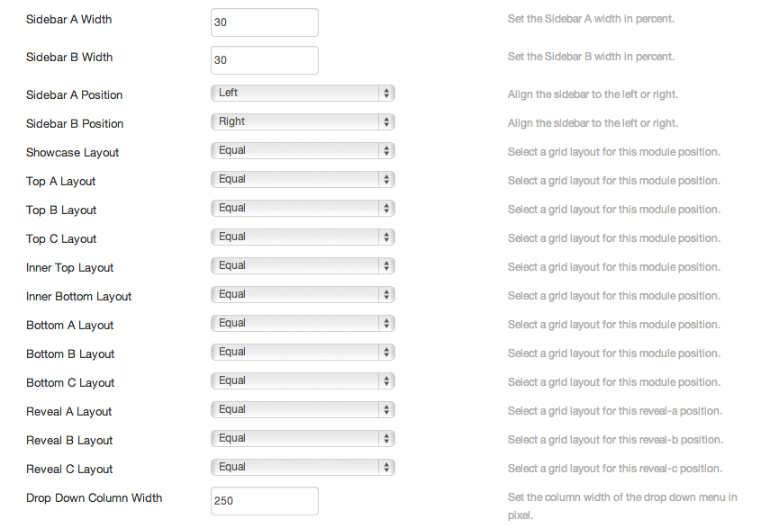
Warp framework comes with a robust layout system to create any kind of sidebar or widget layout. You can easily manage the sidebar's positions and widths in the theme administration. Module layouts can have different styles and be placed in any position offered by this theme.

Each position has its own layout. You can align module layouts side-by-side, stack them or choose your own grid layout. The grid adapts perfectly to your layout even on smaller devices.

Layouts

important
There are other module positions which are hidden by default, namely:

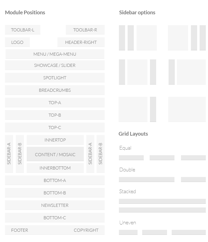
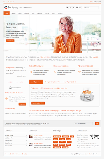
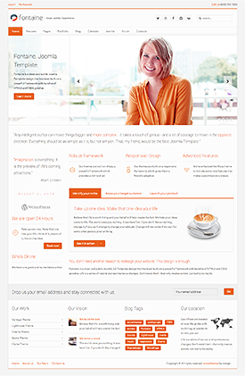
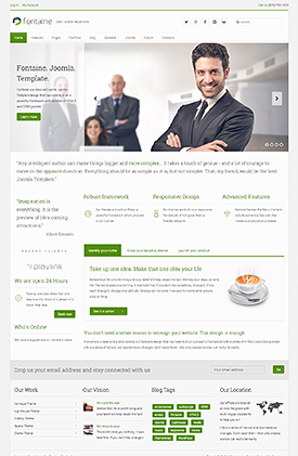
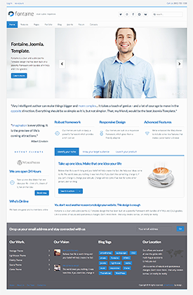
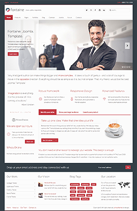
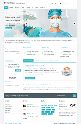
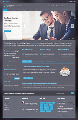
  • off-canvas - Appears on the left to show the mobile menu. It can used to also place other modules
  • reveal-a, reveal-b and reveal-c - shows a module in a popup dialog box. See this page for more information
  • mega-menu - You can use this position to add a third-party menu

Responsive Design

Fontaine Joomla Template is now responsive! That means it supports mobile devices like the Apple iPhone, iPod Touch and Google Android. 


How to view the mobile theme

Simply resize your browser to and see the site respond to the width of the browser

Onze locatie

world-map

Kamperbaan 165, 3940 Hechtel-Eksel
Tel: +32 (0)11 34 27 39
website: www.eble.be
e-mail: Dit e-mailadres wordt beveiligd tegen spambots. JavaScript dient ingeschakeld te zijn om het te bekijken. 

Aeroclub Sanicole is sinds 1971 gevestigd in Hechtel-Eksel op het vliegveld van 'Beverlo'.

Foto & Media

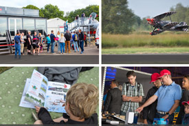
Bekijk enkele foto's van EBLE Sanicole

banner fotoalbum

Onze waardes

Een enthousiast team van bestuurders, havenmeesters en instructeurs staat garant voor de uitbating van het vliegveld en de opleiding van piloten.

Klaar om jouw droom waar te maken: leren vliegen !

Popup Widget

Lorem ipsum dolor sit amet sectetur elit Donec sit amet nibh dolor vivamus non arcu sanctus est penatibus et magnis dis parturient montes consectetur eleifend tempus. Cum sociis natoque penatibus et magnis orem ipsum dolor sit amet sectetur adipiscing elit

Popup B Widget

Lorem ipsum dolor sit amet sectetur elit Donec sit amet nibh dolor vivamus non arcu sanctus est penatibus et magnis dis parturient montes consectetur eleifend tempus. Cum sociis natoque penatibus et magnis orem ipsum dolor sit amet sectetur adipiscing elit

Popup C Widget

Lorem ipsum dolor sit amet sectetur elit Donec sit amet nibh dolor vivamus non arcu sanctus est penatibus et magnis dis parturient montes consectetur eleifend tempus. Cum sociis natoque penatibus et magnis orem ipsum dolor sit amet sectetur adipiscing elit

Lorem ipsum dolor sit amet sectetur elit Donec sit amet nibh dolor vivamus non arcu sanctus est penatibus et magnis dis parturient montes consectetur eleifend tempus. Cum sociis natoque penatibus et magnis orem ipsum dolor sit amet sectetur adipiscing elit